March 16, 2011
The D50 daylight myth
Does 5000K really equal daylight?
Fiction.
GTI is here to debunk some daylight myths for you. In short, 5000K does NOT equal daylight.
Now that that’s cleared up…
5000 Kelvins (5000K) relates to color in that it represents the approximate correlated color temperature of a particular phase of daylight. At this color temperature, a theoretical black body radiator would emit the color of light we associate with this specific phase of natural daylight. So sometimes 5000K equals the color of daylight…not that we’re trying to confuse you.
People in graphic arts and photography always want to know if the light source they are buying is 5000K, but the question they should really be asking is ‘does it equal daylight?’ Or rather, a specific phase of daylight known as D50, which has a correlated color temperature of 5000K (more on that below.) The confusion comes in that 5000K is only one small piece of the puzzle of the phase of daylight it corresponds to, and not all 5000K light is created equal.
There are a variety of ways to create a light source that measures 5000K, not all of which will render colors the way they would appear in natural daylight. Differences in various design factors, for example the number of phosphors used or the phosphor coating on the bulb, affect the way a lamp renders color. The combined energy emitted from the light source might correspond to 5000K, but the color temperature of the light source is not the goal when it comes to color viewing; it’s “daylight.” (We use “daylight” loosely here, meaning just the one specific phase of daylight known as D50.) Light sources are more than just the [color temperature] sum of their parts.
Beware of imitations!
Sure, the lamps you could buy at your local hardware store might be rated 5000K, and they probably cost a fraction of the lamps that we’re going to recommend to you. Hey, they might even fit easily into a quality viewing system, but proceed at your own risk with using alternative 5000K bulbs – and don’t say we didn’t warn you! Regardless of whether that hardware store lamp says 5000K, its properties (i.e. phosphors or phosphor coating) are entirely different than one that’s been specifically designed for critical color viewing. Light sources with different properties will render color differently from each other. The bottom line is that simple.
Because the way you see color depends greatly on light, the factors that make up your lamp’s design – and not just its 5000K rating – are beyond important, they’re absolutely crucial for a successful color viewing light source. If you change the light, you change the color. Even the slightest color shift can have the ability to affect an image’s entire appearance. Not only are all 5000K bulbs NOT created equal, but to further complicate things, using a 5000K bulb is not the whole solution to your color viewing problems on its own. To fully understand why you need to fulfill more than just 5000K, here is everything about the other factors that are taken into account to determine optimal viewing. Luckily you can leave the complicated lighting stuff to us, managing color is complicated enough!
Here’s how to spot the real deal.

Every light source has a unique fingerprint, its spectral power distribution (SPD), which identifies its exact energy levels at each wavelength along a spectrum. Please try to hold back your yawns. Basically what that means is, the identity of your lamp is its SPD – a graph of its energy – and the combination of that energy results in a very specific color of light. The phase of daylight accepted as the industry standard for graphic arts and photography has an SPD called CIE D50, which as we said earlier has a correlated color temperature of 5000K. But you already know all about this or else we would’ve lost you to utter bewilderment at the start here.
Since it’s the industry standard, this SPD measurement is the ultimate (albeit more elusive than 5000K alone) goal in the design of color viewing light sources. This is why some 5000K lamps are significantly cheaper than others, because the engineering behind a lamp that is also close to the SPD of D50 is much more complex and difficult to accomplish. There are any number of light sources that tout a 5000K measurement, but unless they also have an SPD corresponding to D50, using these types of light sources – EVEN if you’re putting them into a high quality viewing system – will result in countless wasted resources and hours, attempting to unnecessarily correct for color discrepancies. In summary, SPD is where it’s at, not 5000K.
We’ll help you see the light…

That international industry standard we mentioned earlier is called ISO 3664:2009. It’s written for color viewing lights that aim to be as close to the D50 spectral power distribution as possible. The standard requires not only that light sources used for color viewing be a close match to D50, but also that this spectral measurement be accurate at the surface of the object you are viewing, NOT at the light source. GTI goes further than just designing lamps at a superior accuracy to CIE D50 – we account for all the other factors that could possibly influence the way you see your image’s color. Well, all factors with a few physical and psychological exceptions…
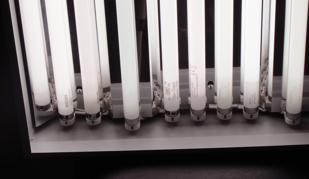
Now in case you were still dubious, take a look at the lamps in the photo below. These are real lamps we’ve purchased from a variety of places. Each one of them is rated at a 5000K color temperature…but they’re not all the same color when they’re lit. How do you think that difference would affect how you see color? How would that affect how you design your images?
Still want to use just any 5000K lamp to design your product?
We don’t want you to either!
To help you take a comprehensive look at all the essential factors that are involved in creating an effective color viewing light system, please see our article, ‘What is ISO 3664:2009?’ Controlled color viewing lighting is essential for consistency, efficiency, accuracy, and communication when it comes to color management.
